The Issue
Quality DME already had a website up and running but it wasn’t achieving the needs of the business.
When they first created their website, they opted to create it with a drag and drop website builder on their own. This option got a website up and running, but later found that it wasn’t meeting their needs and wasn’t helping the business grow.
Their website wasn’t a very aesthetically pleasing and looked outdated. Their current customers weren’t benefiting from the website, and they needed to attract more customers. Another big problem was that they needed to start an online store to begin selling products online.
The Solution
We asked many questions, became extremely clear and studied the needs of Quality DME. We understood what they needed and put a plan together.
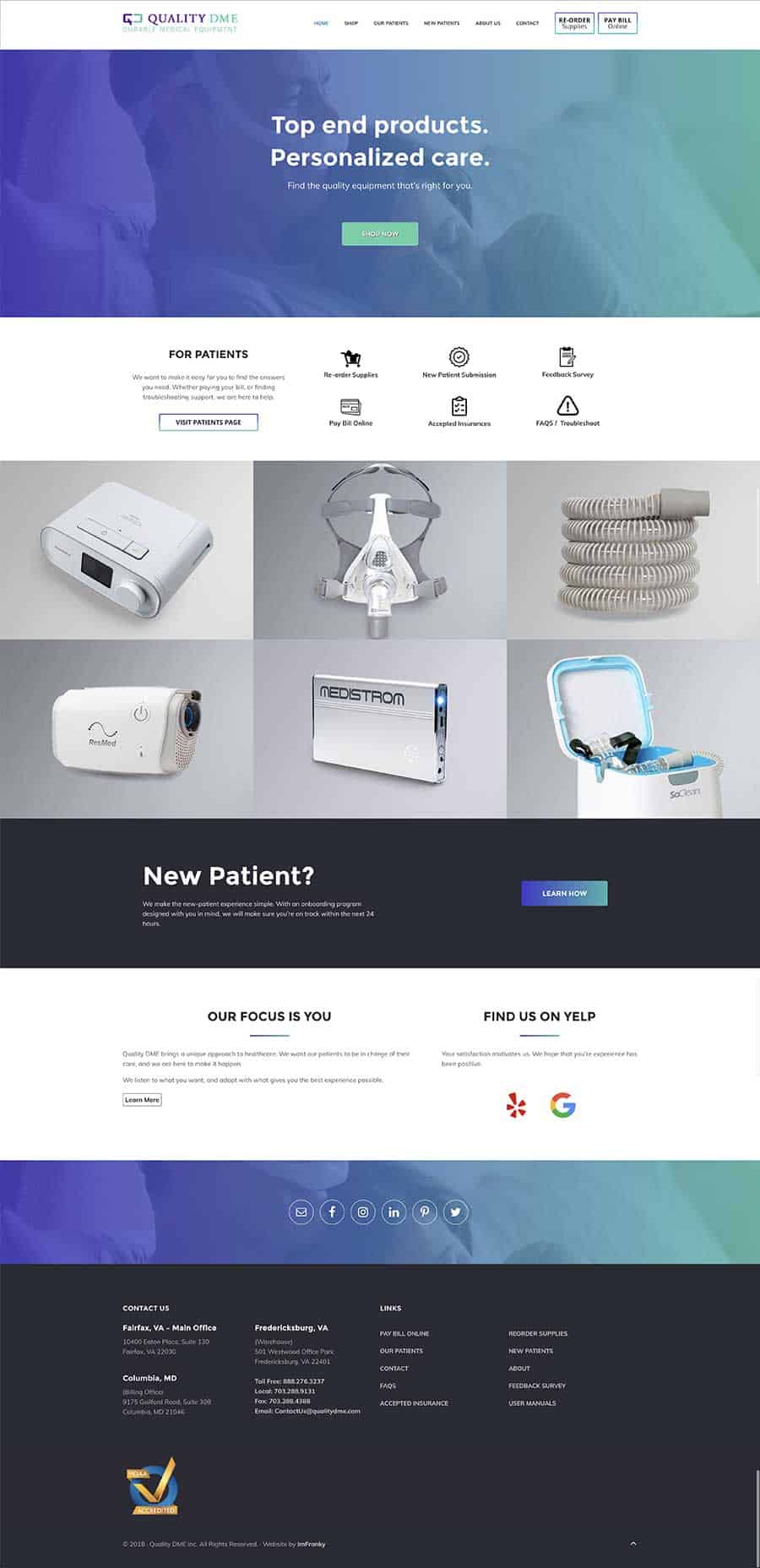
We needed to make the new website look exciting, and make customers feel confident about the company. We worked with their brand colors and chose a perfect design that gave a professional feel, while keeping it clean, simple, and exciting.
Immediately after sending over the design they responded to us that they loved it. They said, “Simplicity” was huge, along with achieving all the needs was amazing.
We built a store and added all the products to get it ready, however this wasn’t any ordinary store. This store had to be customized in a way, that focused on using a form instead of the normal shopping cart. The business did business differently and we had to customize the store to look like any online store but with the option to use a form and removing the online cart.
The patients page was added with much detail to ensure their customers where getting the time and care that they needed. Helpful information, documents, and links to important information was added to help customers with common questions. This would save time from unwanted phone calls for the business.
We made sure to focus on the main points Quality DME wanted to get across and added several “Calls to Action” to make sure the customer could clearly see all the significant parts of the website. Getting customers to view the online store, pay their current bills, and re-ordering supplies were extremely important. That is why, without being pushy, we made sure to allow a place to view those important links.
After getting it all done, we made sure it was easily viewed on all devices. We tested it, and launched it.
The Result
After much time and effort, we ended with an exciting final product. The website was done and the management at Quality DME just loved it. They loved the design, they loved the store, and were excited to show off their new professional website that accurately expressed who they really are. They can now feel confident they’ll have a great first impression, get new customers, and take care of their current ones.

